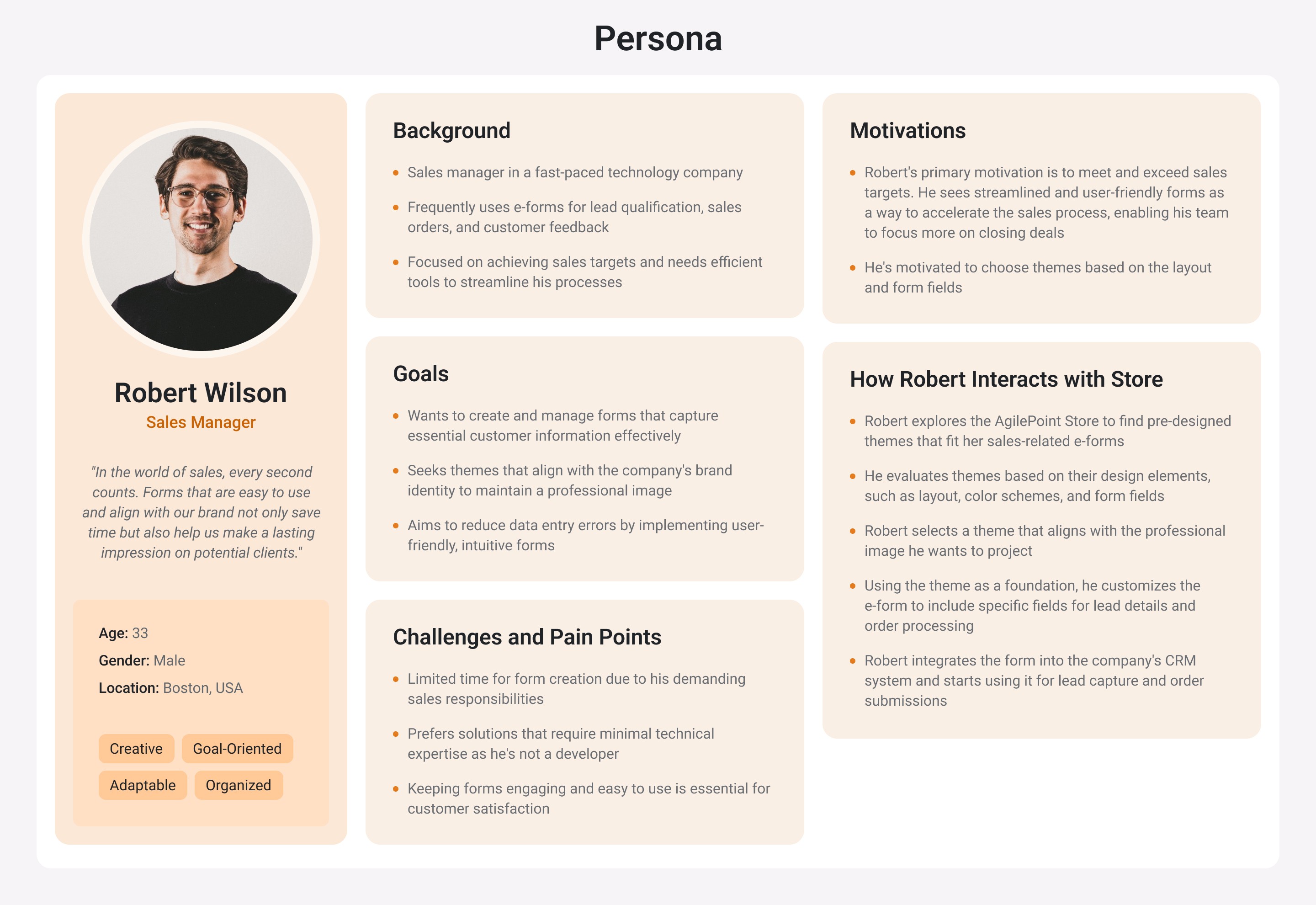
AgilePoint Store Redesign
Redesign
Duration
1 month
My role
Lead UI/UX Designer
Tools
Figma
Project Summary
The App Store is a feature of the AgilePoint NX platform that offers theme templates for eForms. These templates can be downloaded and applied to forms, allowing users to easily customize the appearance of their forms without having to create styles from scratch. More technically skilled users can even modify the templates to further customize the look and feel of their forms on the AgilePoint NX platform.
Problem
The UI needs to be updated to align with the new branding and match the overall design of the AgilePoint NX product.
The team has a goal of improving the usability and consistency of the AgilePoint store in order to enhance the user experience and make the product more intuitive to navigate.
By making the product more accessible and enjoyable for users, we hope to increase satisfaction and productivity.y
Process & Research
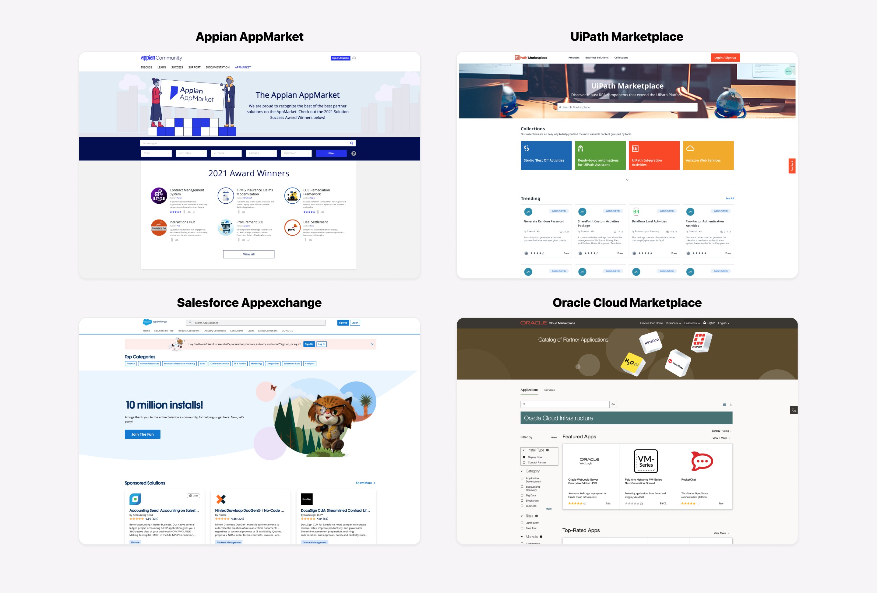
I started the project by reviewing the existing AgilePoint store and identifying areas that needed to be updated to align with the new branding. I also conducted a competitive analysis to understand what was working well for other products in the market. With this information, I created low-fidelity prototypes and then moved on to high-fidelity prototypes, using my findings to inform my design decisions. As I progressed, I regularly kept stakeholders informed of my progress through presentations and regular updates.
lO-FI Prototype
Moving forward with the process, I created the lo-fi prototypes to represent my ideas on improving the store's usability and consistency, considering the goals of enhancing the user experience and making the product more intuitive to navigate.

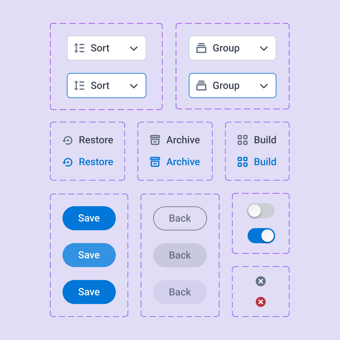
Visual Design
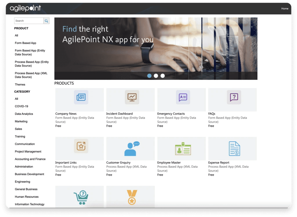
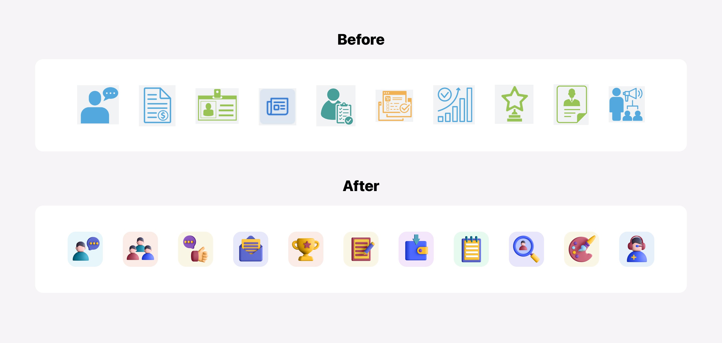
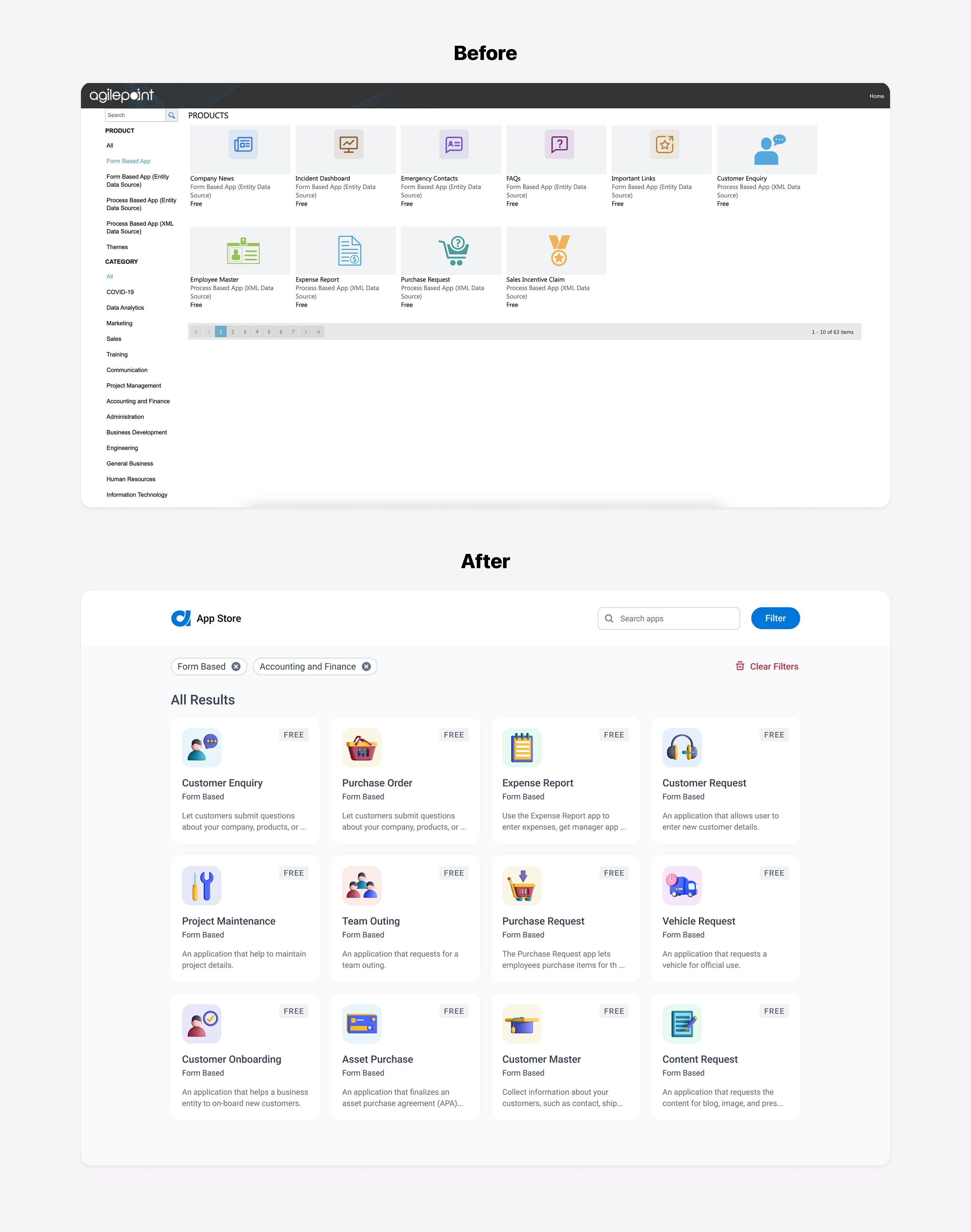
The store had over 60 app icons that were inconsistent in terms of style, size, and design. In order to create consistency and give the icons a fresh new look, I suggested to the team that we redesign all of them with the hope of creating a delightful and emotional connection with our customers. Below, you can see a comparison of the before and after:
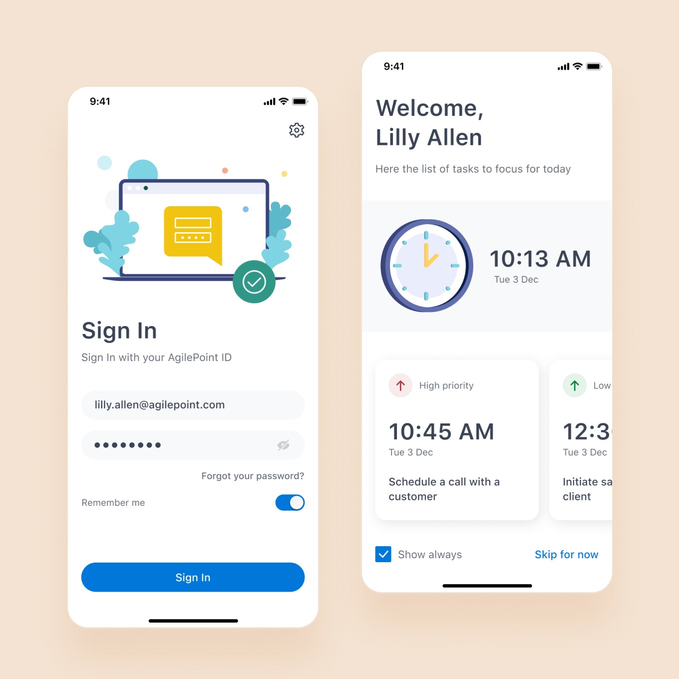
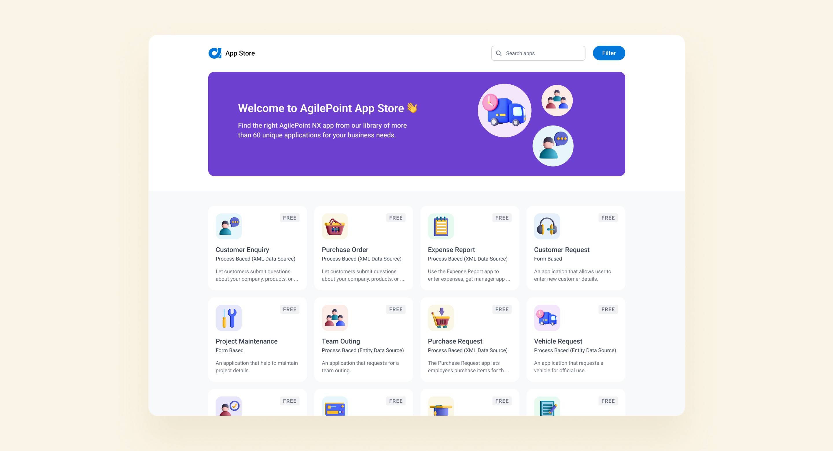
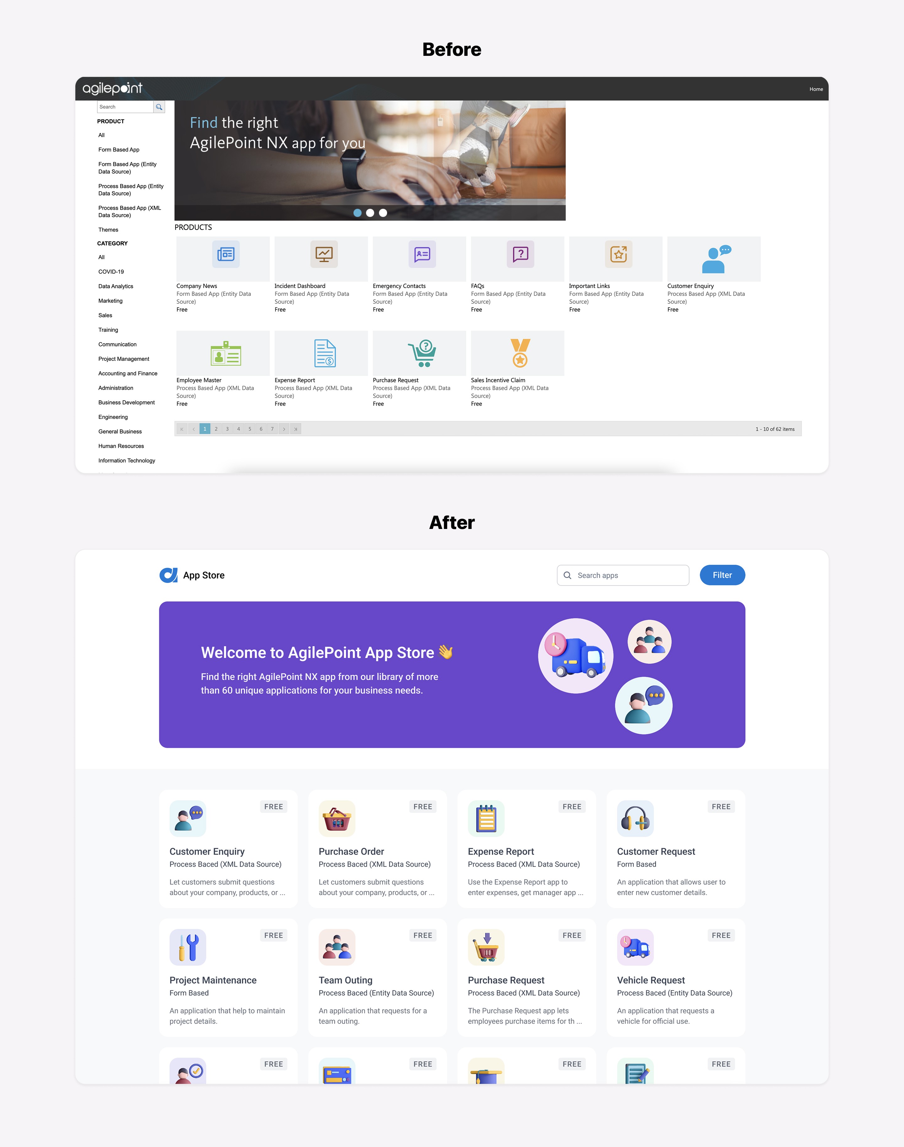
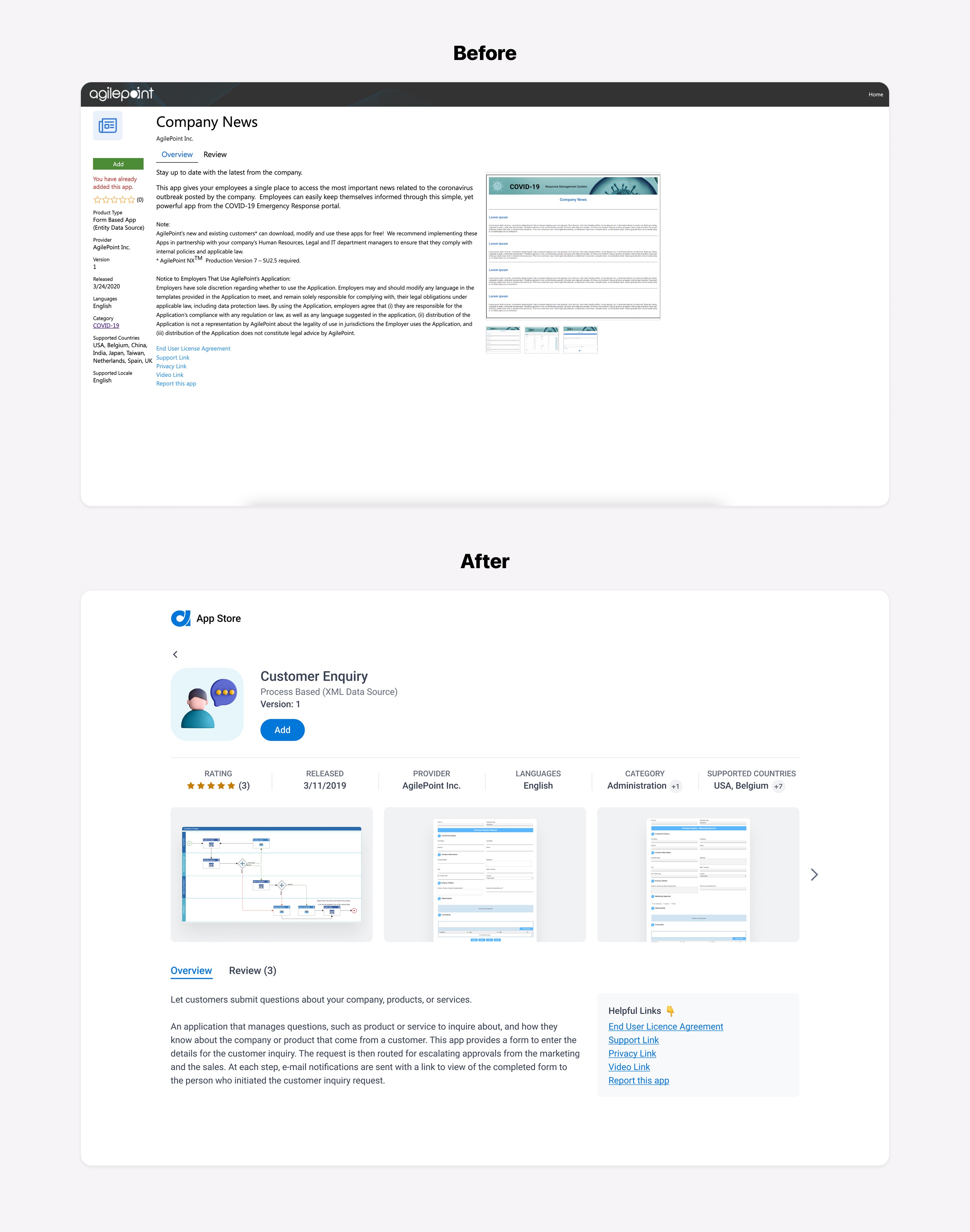
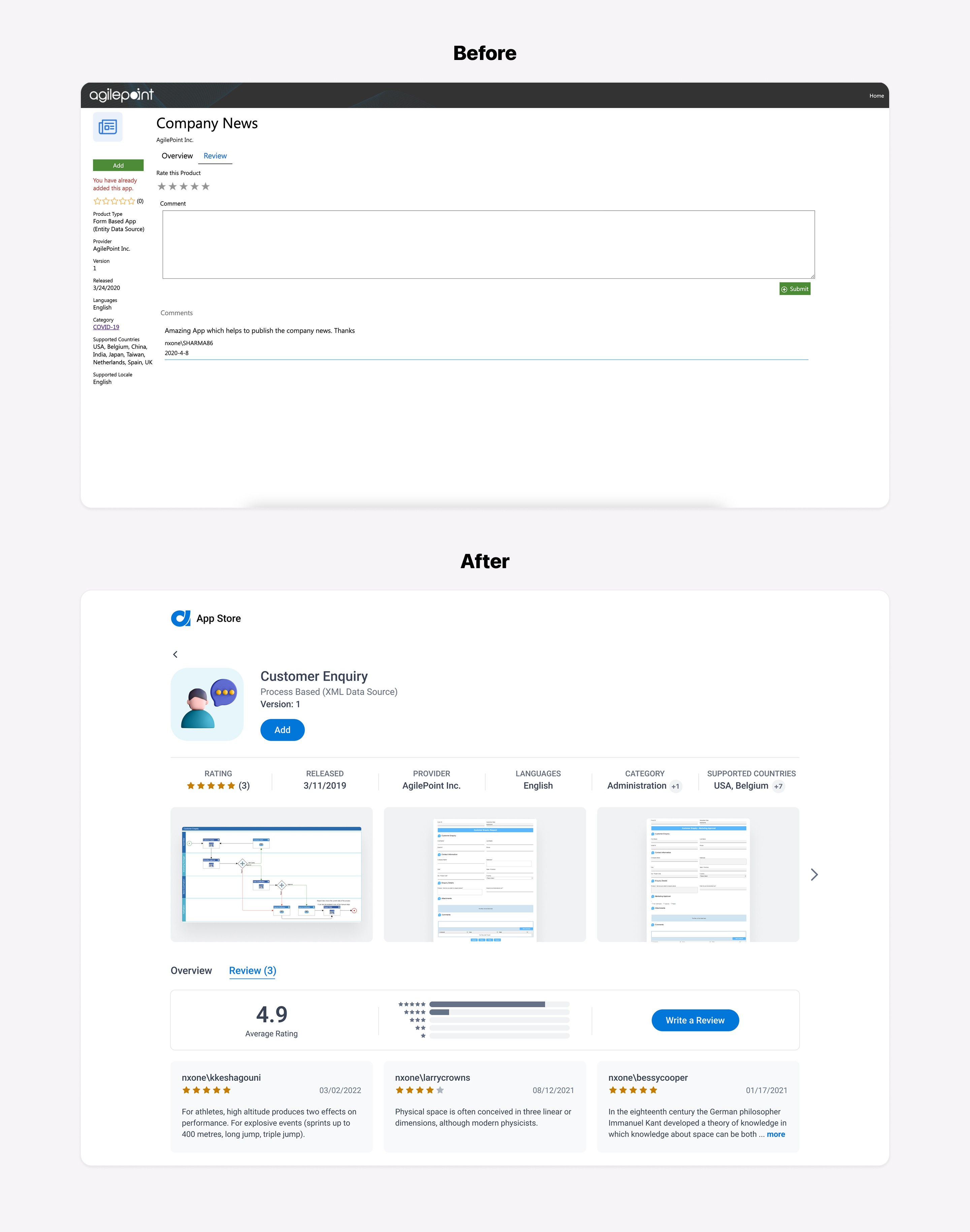
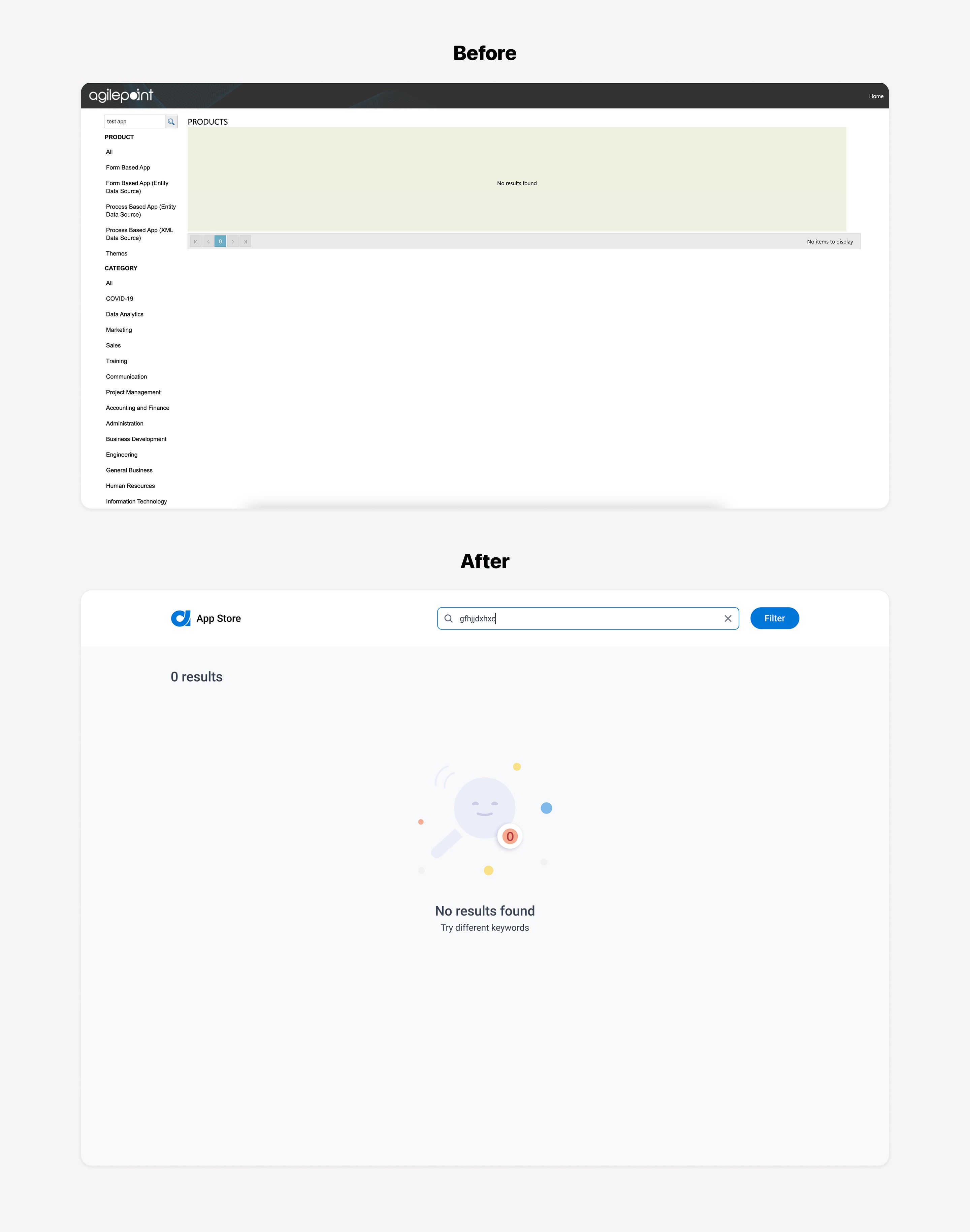
The next step in the design process was to convert the low-fidelity prototype into high-fidelity screens. After another review session with stakeholders and making a few changes based on their feedback, I was able to finalize a new UI that addressed all the issues we had. The comparison below shows the before and after screens:
Final Clickable Prototype
I created a clickable prototype to evaluate the functionality and usability of the new design. I shared it with my team members to gather their feedback. After that, I had a final meeting with the development team and presented the prototype with the goal of ensuring a smooth implementation process.
Outcomes
After completing this project, it's clear that updating the UI and improving the usability and consistency of the AgilePoint store were critical steps in enhancing the user experience. By aligning the design with the new branding and making the product more intuitive to navigate, we were able to create a more enjoyable and efficient tool for users. We hope these changes will increase our users' satisfaction and productivity. Overall, this project was a success and we are confident that these improvements will have a positive impact on our users.