AgilePoint NX Mobile app Redesign

Mobile App

Duration

5 months

My role

Lead UI/UX Designer

Tools

Sketch, InVision, Figma

Project Summary

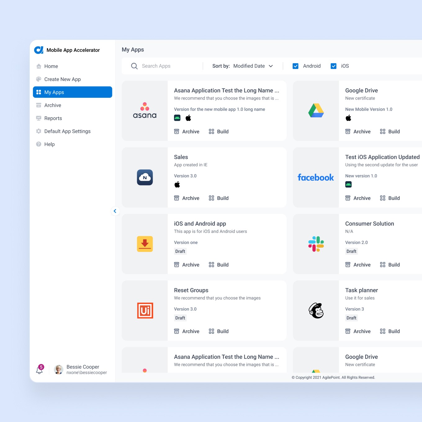
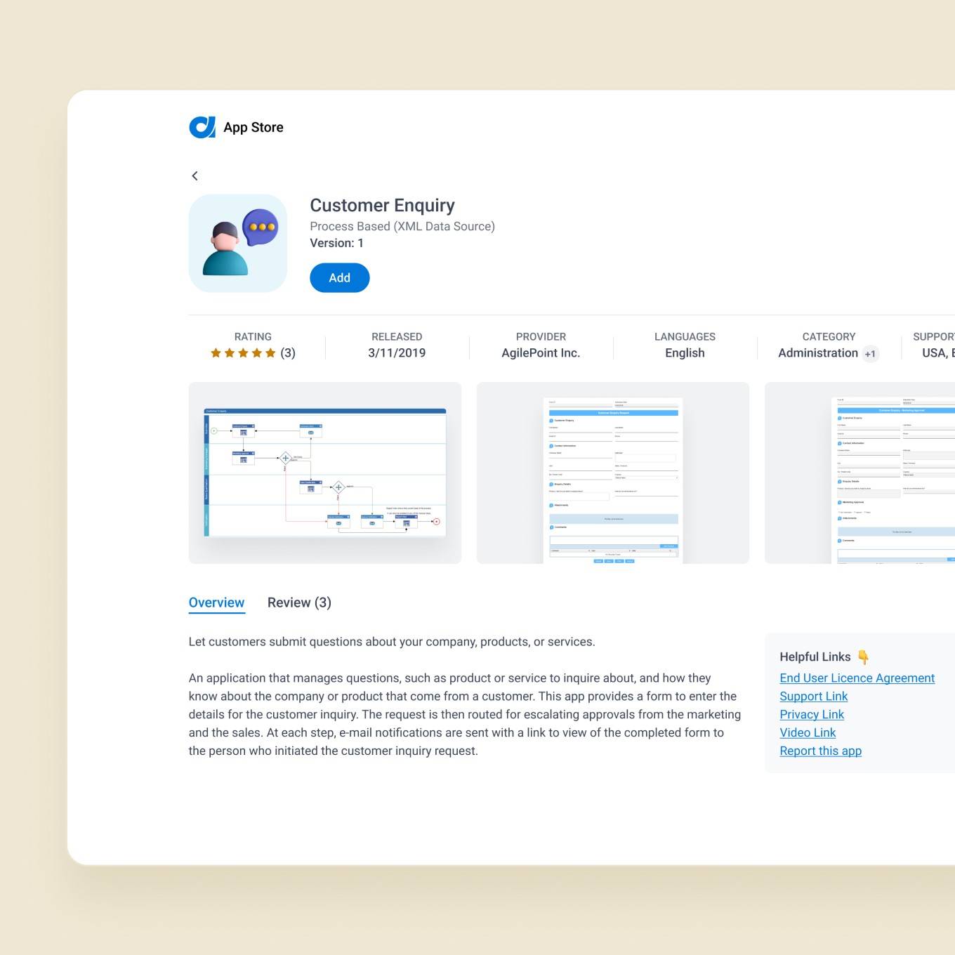
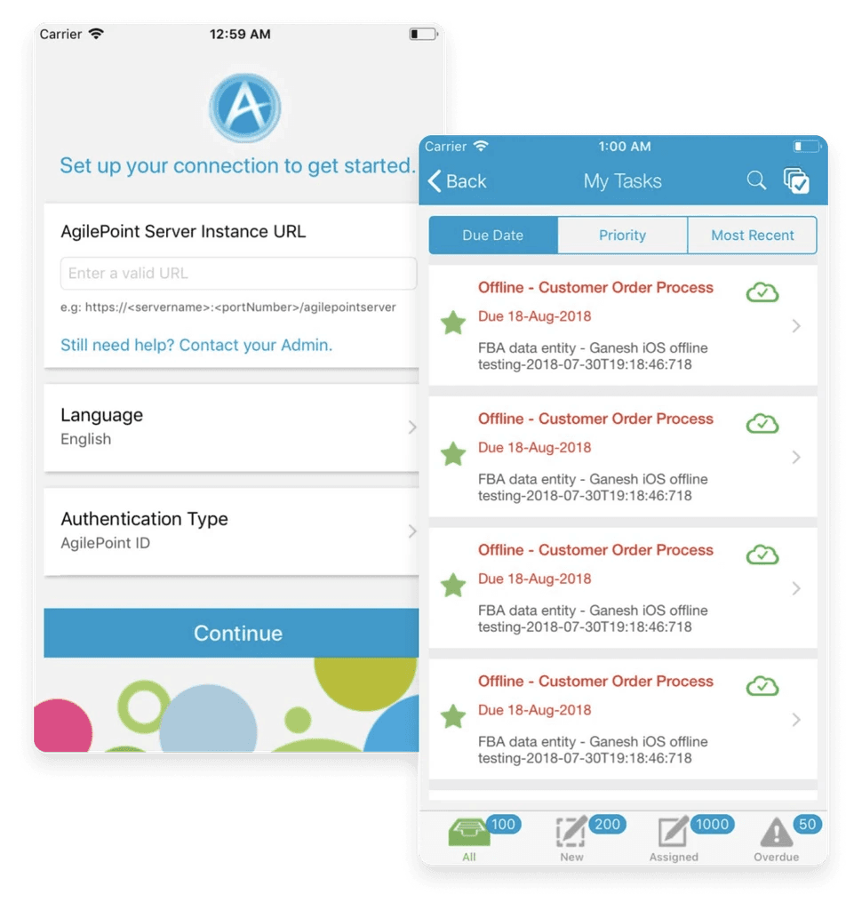
The AgilePoint NX app helps to view and manage tasks on mobile devices and access our customer's enterprise applications running on the AgilePoint Platform. The app provides similar functionality to the Modern Work Center (one of the platform components). Our customers can customize the app based on their brand: change the logo, themes, and images that match their company branding with a paid add-on functionality of the AgilePoint NX product - Mobile App Accelerator. The original app was designed five years before this redesign.

Key features

Access enterprise apps on your mobile device

View and execute your business tasks

Manage your team’s activities, and collaborate

Reassign, delegate or cancel tasks

Manage tasks efficiently using the day planner

Visualize live business process flow and user participation

Problem

  • The app needed a visual refresh and an improved User Experience

  • A team wanted to focus on bringing everything our customers know and love in the Modern Work Center to mobile devices

  • We wanted to keep a delicate balance between the existing app and new capabilities and features without adding obstacles such as additional training.

Inventory/Audit

When I joined this project, the team had already started exploring the ideas. I was onboarded with some documentation and thoughts they began coming up with to understand the background better. After all opinions and ideas were collected, we made a document that includes medium fidelity screens with an explanation to review with stakeholders:

Visual Explanation

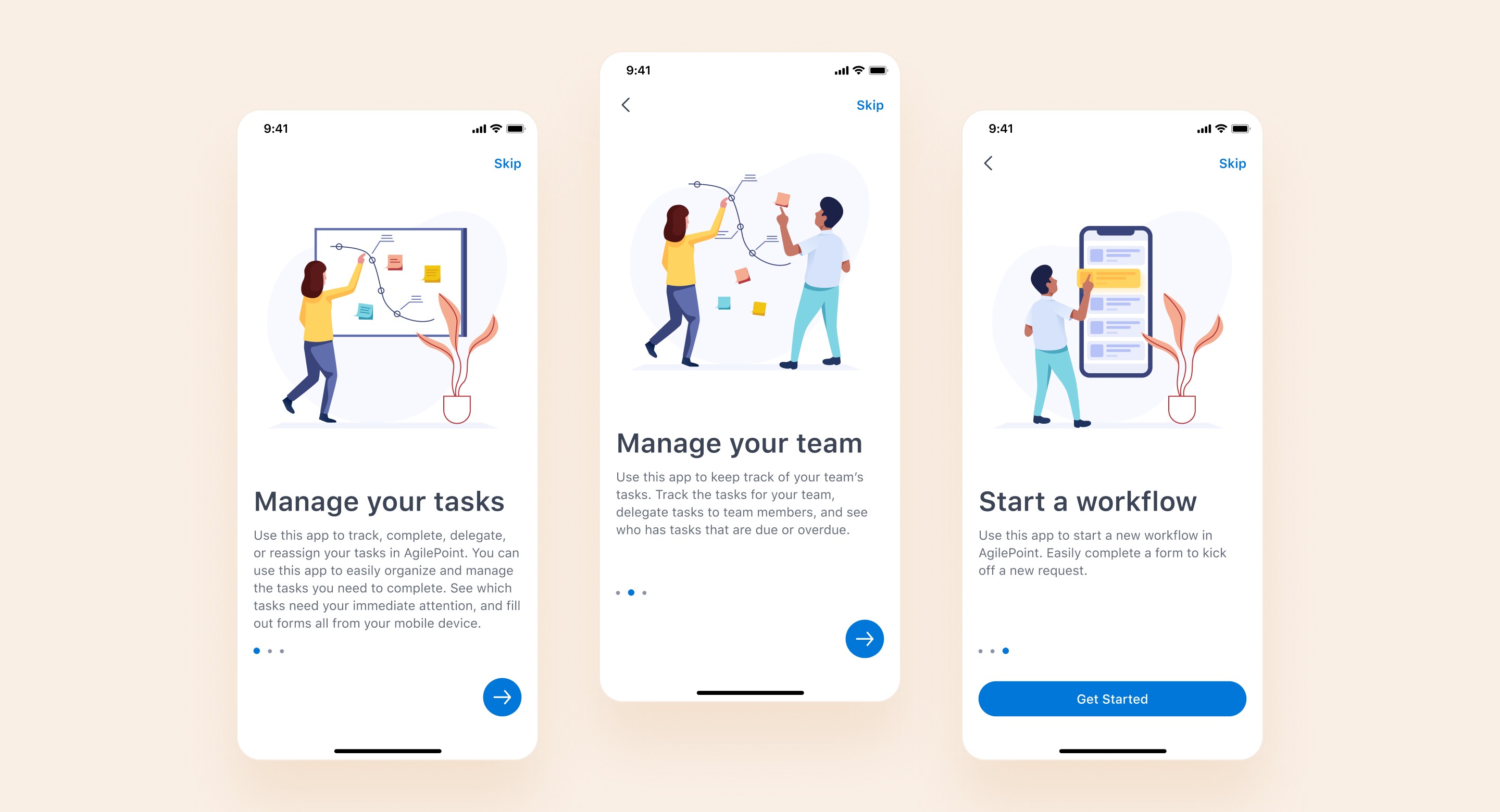
Based on the feedback collected, I started creating UI Screens. I wanted to focus on simplicity and functionality, so I have chosen white and light grey as base colors, adding blue as a primary. Also, I defined adding some visual language as illustrations to our app with the hope of creating delight and emotional connection with our customers. At first, I created UI for the five main app screens:

60+ Screens in total

Then I presented them to the stakeholders for review and got positive feedback, so I was able to finalize the rest of the screens:

Final Clickable Prototype

I wanted to see the app from a user's perspective, so I made a clickable prototype and tested it, challenging myself to ask the same question on every screen: "Does the user know where to go next from here? If not, what do I need to change to do that?" I also asked the teammates to taste it to collect all opinions. After a few rounds of iterations, I was able to finalize the prototype:

Outcomes

I worked closely with the engineering team to ensure that there was no inconsistency between the design and app implementation. After a few rounds of build review and testing on devices, we were able to update it on App Store - link As a result of this redesign, our app got consistent aesthetics with improved accessibility. Also, our users got full feature parity with the desktop experience.


One of our new features, a powerful day planner to set reminders to work on tasks, start new requests, or make a note to yourself, got very useful based on what we hear from the customers.

Key Learning

Balancing Familiarity and Innovation

Redesigned a five-year-old enterprise mobile app with a modern UI while preserving the familiar features users love. This careful balance ensured existing users could adopt the new version immediately, without any need for retraining or confusion.

Balancing Familiarity and Innovation

Redesigned a five-year-old enterprise mobile app with a modern UI while preserving the familiar features users love. This careful balance ensured existing users could adopt the new version immediately, without any need for retraining or confusion.

Balancing Familiarity and Innovation

Redesigned a five-year-old enterprise mobile app with a modern UI while preserving the familiar features users love. This careful balance ensured existing users could adopt the new version immediately, without any need for retraining or confusion.

Seamless Cross-Platform Continuity

Brought all key capabilities from the desktop “Modern Work Center” into the mobile app, achieving full feature parity across platforms. This consistency allowed users to seamlessly switch between devices and enjoy the same functionality on mobile as on desktop.

Seamless Cross-Platform Continuity

Brought all key capabilities from the desktop “Modern Work Center” into the mobile app, achieving full feature parity across platforms. This consistency allowed users to seamlessly switch between devices and enjoy the same functionality on mobile as on desktop.

Seamless Cross-Platform Continuity

Brought all key capabilities from the desktop “Modern Work Center” into the mobile app, achieving full feature parity across platforms. This consistency allowed users to seamlessly switch between devices and enjoy the same functionality on mobile as on desktop.

Clarity and Delight in UX

Refined every screen through user-perspective prototype testing, making sure the interface stayed intuitive so users always knew what to do next. We also added friendly illustrations to inject moments of delight and personality into the app, making the experience engaging as well as efficient for mobile users.

Design–Engineering Synergy

Involved engineers early in the design process to verify technical feasibility and co-create practical solutions. This close designer–developer partnership – with regular build reviews and device testing – ensured the final app matched the design with no inconsistencies in implementation.