Design System and Style for AgilePoint NX Platform
Design Library
Duration
5 months
My role
Lead UI/UX Designer
Tools
Sketch, InVision, Figma, Accessibleweb.com
Project Summary
In 2016 AgilePoint launched AgilePoint NX v6.0, and for the next few years, the separate teams created their own unique styles without having any documentation and guides. The product got a lot of inconsistencies. When I join to the company in 2019, I started defining how to improve the end-to-end design process to increase the usability and consistency of the current product. After discussing with cross-platform teams and stakeholders, we decided to redesign the AgilePoint NX platform. As a starting point, I initiated and led the creation of the first Design system that also helped build better collaboration and communication between teams.
Problem
Too many unique colors across the platform, they were very close to each other in hex value. Most of the colors didn't pass the accessibility contrast test.
All buttons being used have too many unnecessary visual variances. They are inconsistent in terms of size, design, states, content rules, and interaction.
Styles on a single page were inconsistent with themselves.
Inconsistent usage of icons and graphics with too many different styles led to user confusion.
All of this problems negatively impact on the people’s experience, since the interface that aren't consistent usually yield confused and frustrated users and might drive even the most promising products to failure.
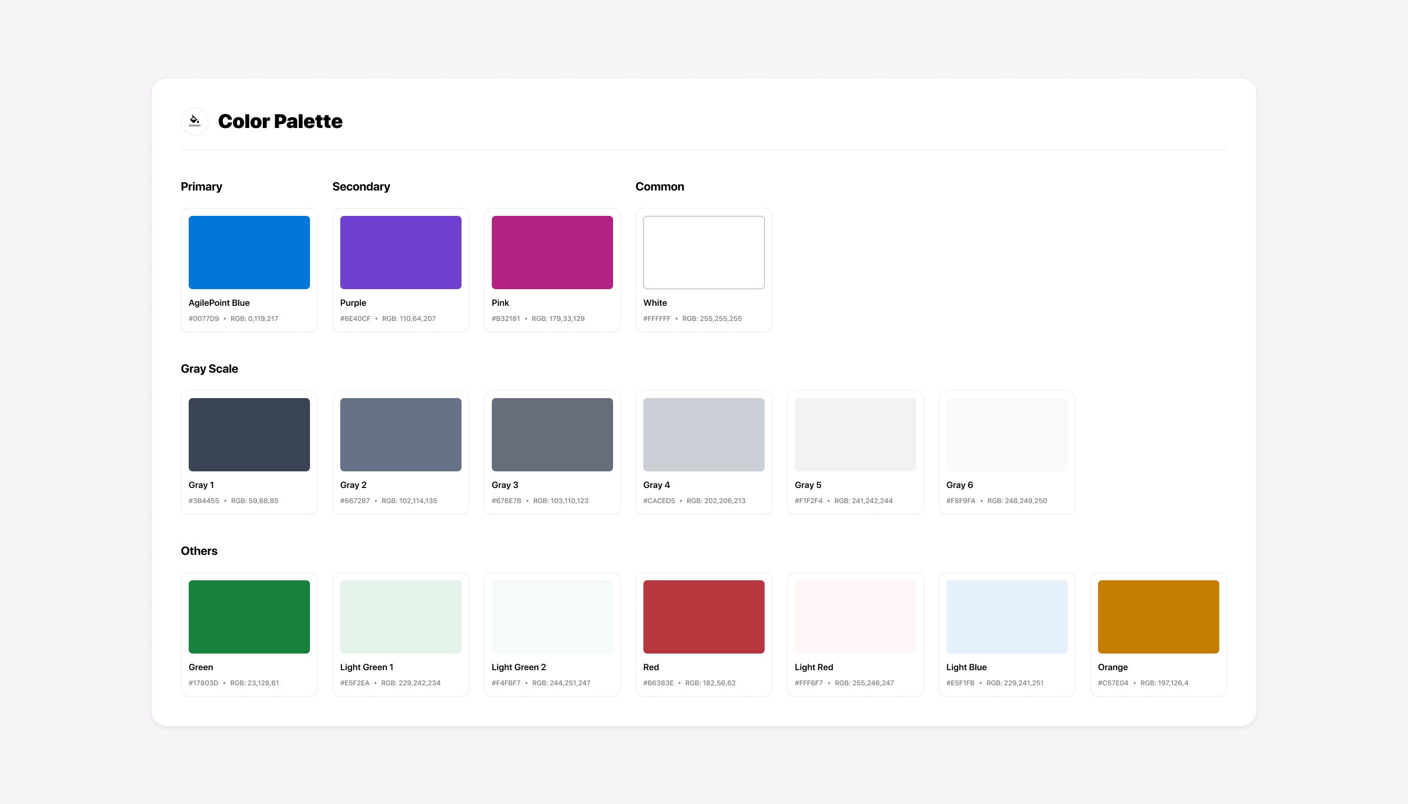
Color pallet
We decided that this was an excellent time to refresh the color palette since one of the main problems to solve was to ensure the colors passed the accessibility contrast test so that “EVERYONE” would have a better experience. Also, we wanted to help guide the user to important elements on the screens by new refreshed colors that provide a bit of pop that feels lively. I defined AgilePoint Blue as a primary color because it builds trust, a feeling of loyalty, reliability, and responsibility.
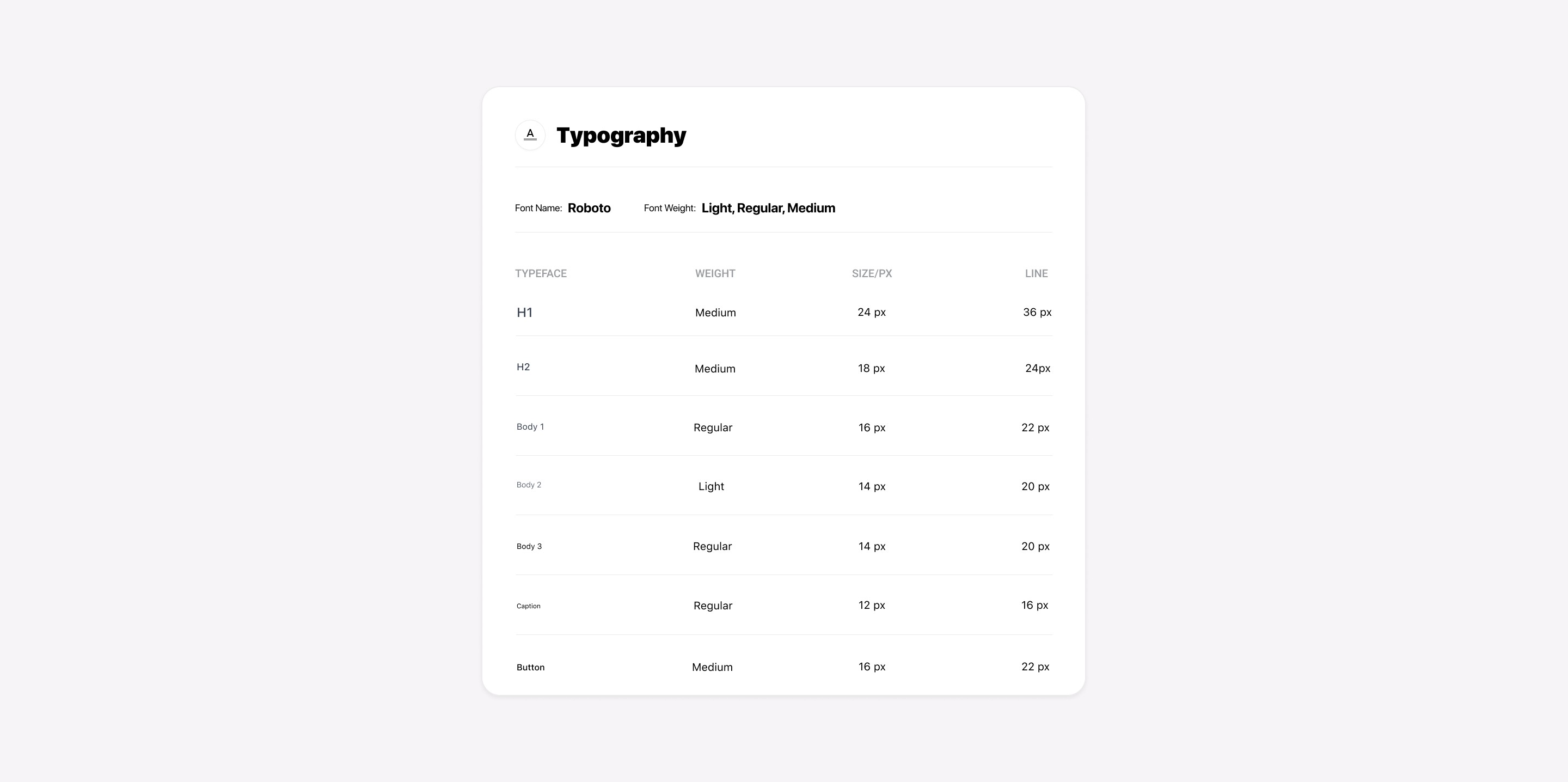
Typography
All typography used in our platform appears inconsistent in terms of style, typefaces, hierarchy, and line spacing. By analyzing and understanding AgilePoint's typographical needs, which include a die-hard focus on legibility, efficiency, and localization, I have chosen the "Roboto" font family and predefined the weight, sizes, and line spacing.
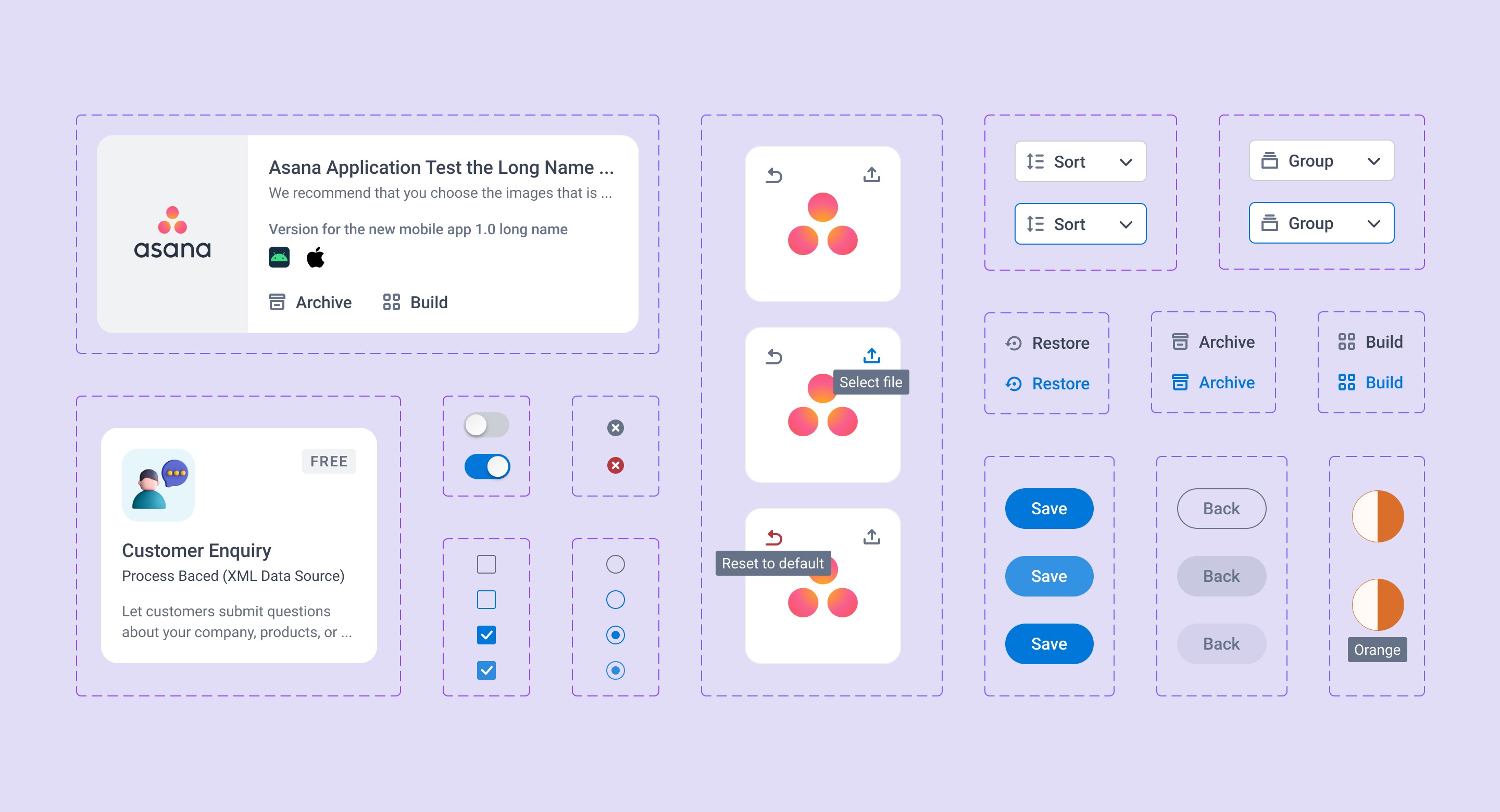
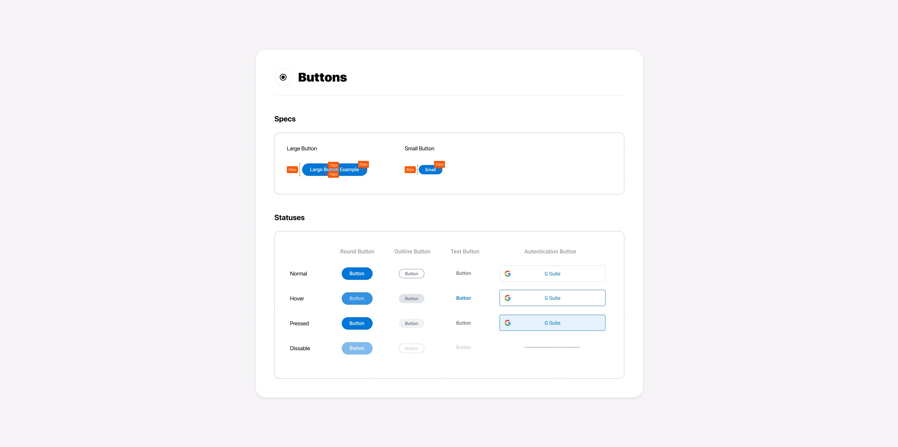
Buttons
One of the main problems was that the user didn't get feedback on the interactive button (no hover, no pressed states, etc..), which led to confusion. I defined a total of 4 button states to improve user interaction. I also divided recent buttons into the Round, Outline, Text, and Authentication categories to decrease visual variances that are not necessary.
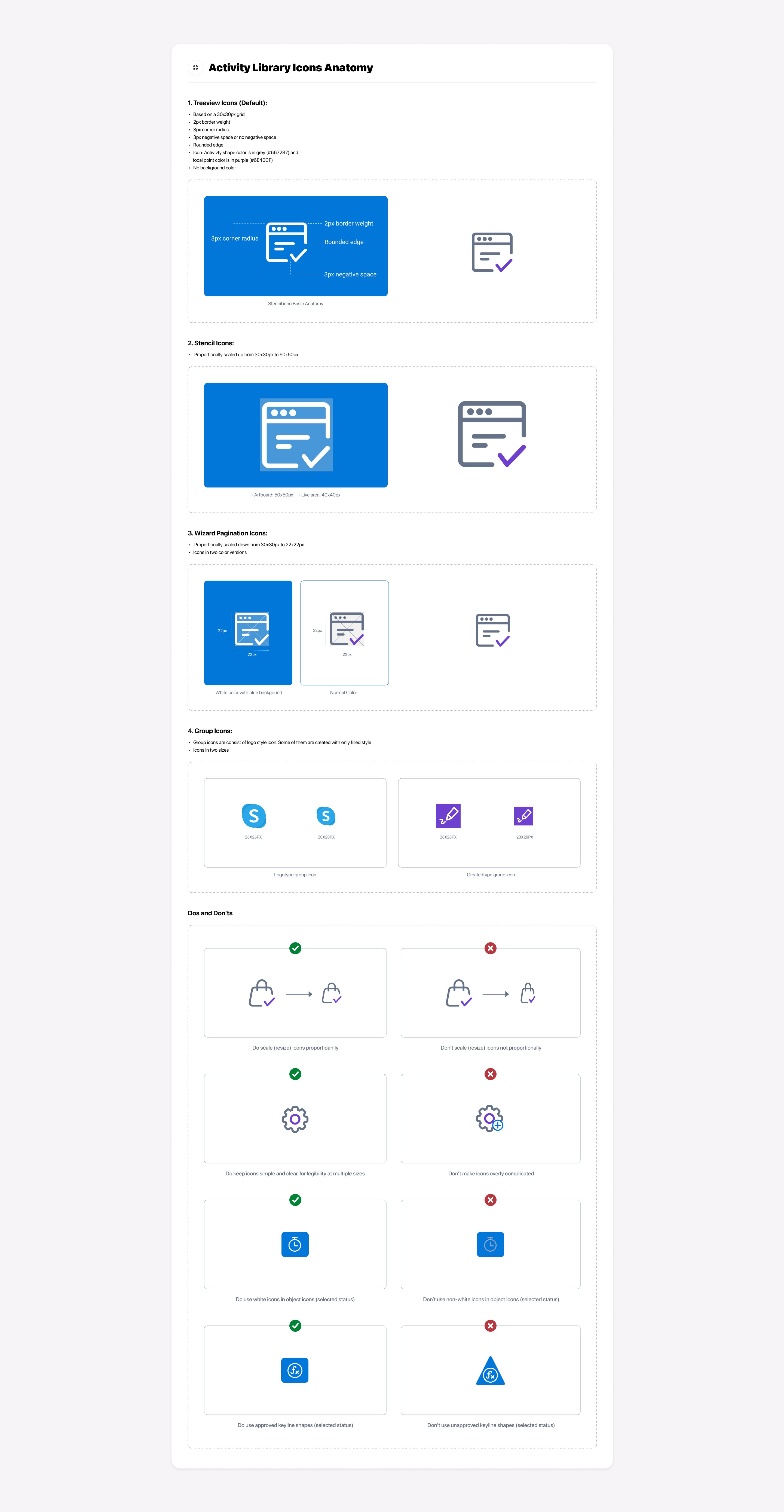
Icons
One part of our product contains an activity library section that includes about 50+ categories, and each of them has Utility icons that identify labels. In total, there were about 450 of them. They weren't consistent regarding varying shapes, styles, and designs. After a discussion with a team, we decided to redesign all of them. To ensure that we will have consistency in the future, I initiated the creation of Icon anatomy since the total number of icons is increasing from time to time.
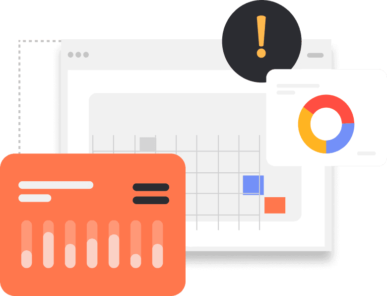
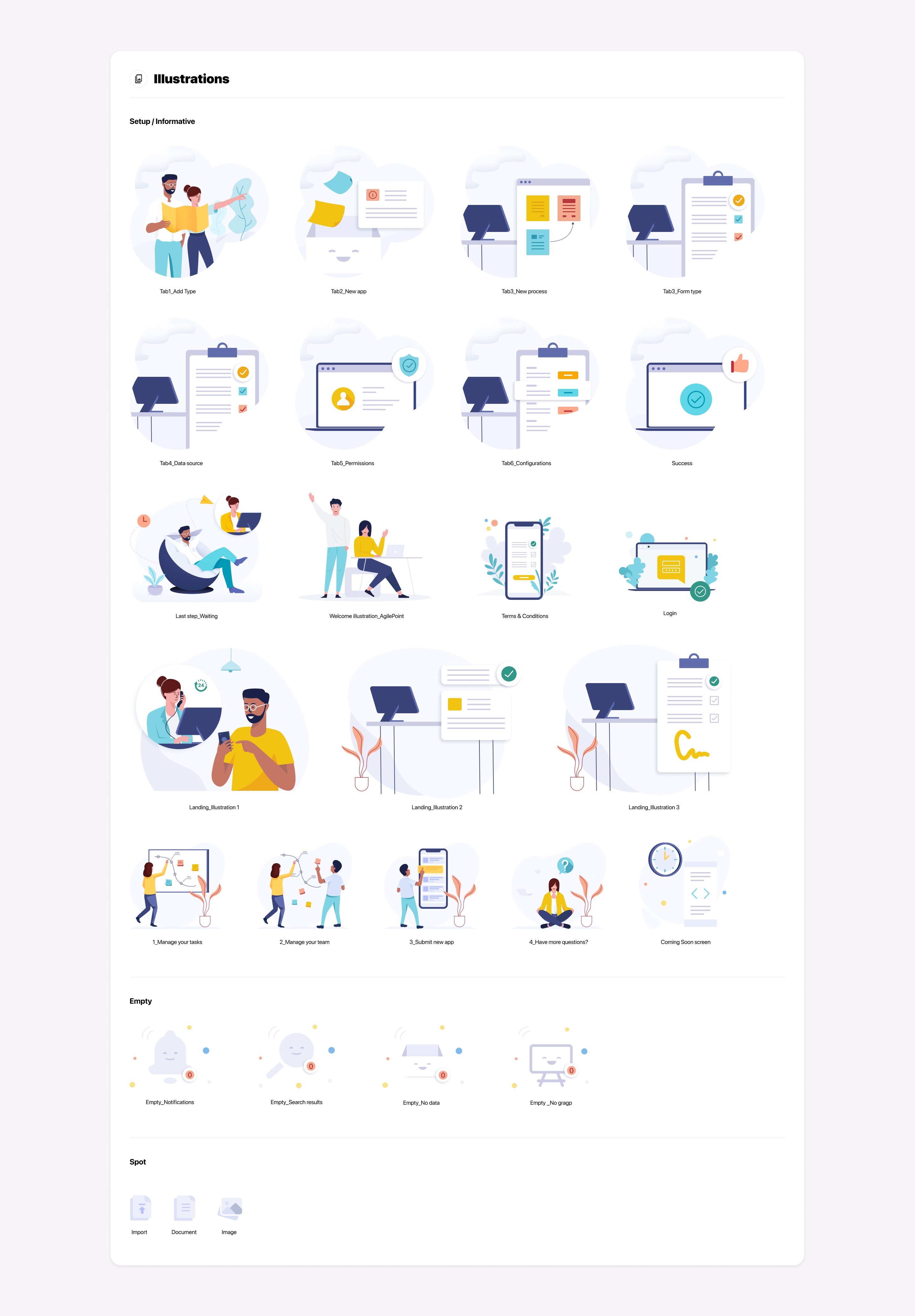
Illustrations
As part of the Design System, I initiated creating illustrations with the hope of bringing more visual language and personality to the product and delight and emotional connection with our customers. I defined three types of illustrations as "Setup/Informative," "Empty," and "Spot":
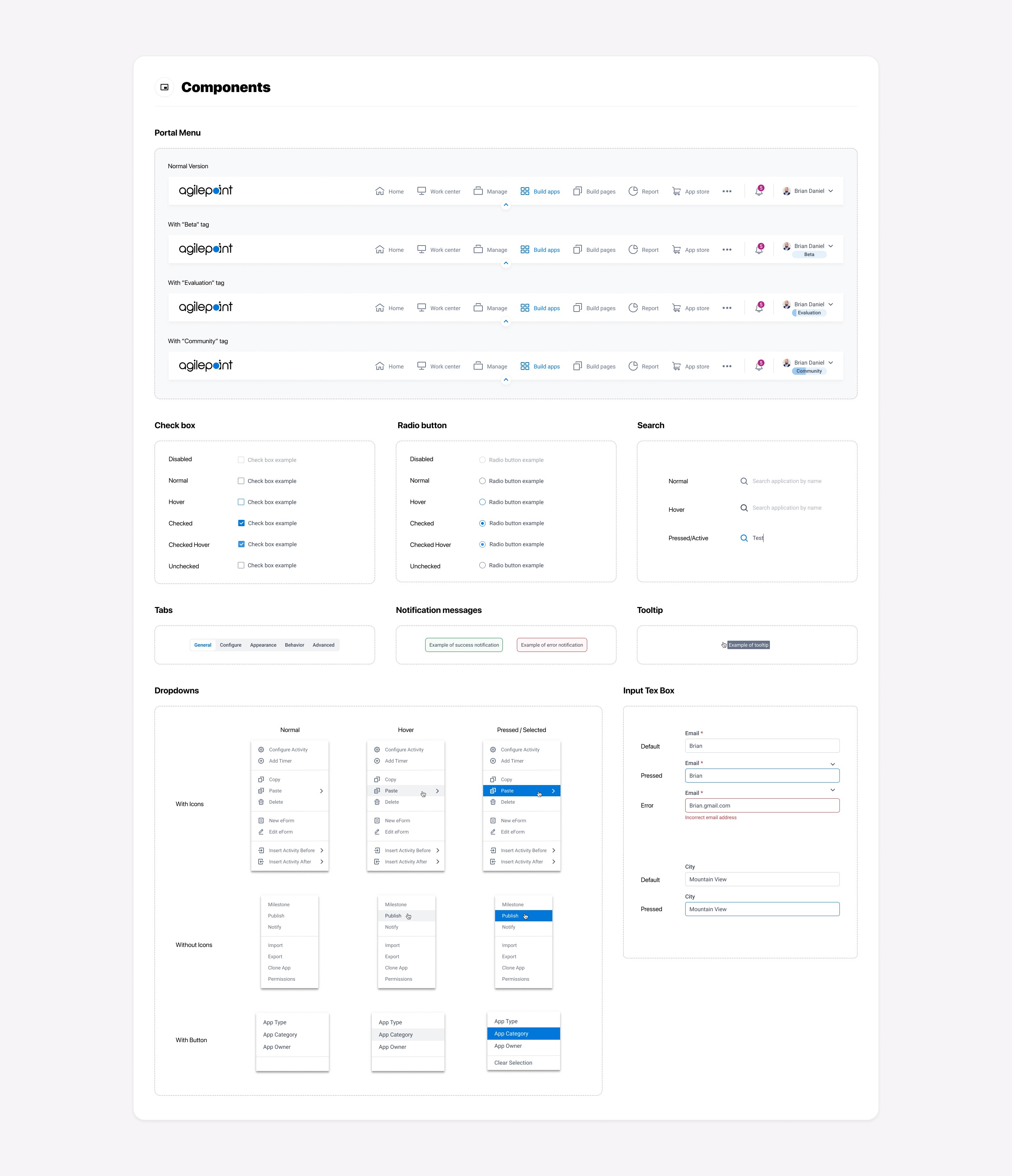
Components
As a part of the Design System, I have created reusable UI components like checkboxes, radio buttons, notification messages, drop-downs, etc., to provide intuitive and consistent user experiences. Hence "Everything looks and works the same way.”
Outcomes
We increased efficiency through a structured process (design thinking) applied to the Design System and improved the collaboration between cross-functional teams. Our product got consistent aesthetics and functionality, creating a better overall user experience, and improving learnability, brand awareness, and error reduction for our customers. As a result, we got positive feedback from our customers.