App builder

Mobile App

Duration

3 weeks

My role

Lead UI/UX Designer

Tools

Sketch, InVision, Figma

Project Summary

App Builder is an AgilePoint NX component that provides all the tools needed to define, configure, and publish custom apps, including key features such as the Process Builder for defining app logic, the eForm Builder for creating web-based forms, and Data Entities for managing custom data models within the platform. As a team member responsible for the 2020 redesign, my primary focus was modernizing the user interface to align with the new branding and the overall AgilePoint NX product design while still preserving all existing functionality due to the tight release timeline. Later in 2022, after gathering extensive user feedback and carefully evaluating their needs, we recognized the importance of making further improvements and began planning the next phase of enhancements.

Problem

  • The current design of the home screen presents plenty of information, resulting in user confusion and decreased engagement.

  • The hierarchy of elements within the interface is not intuitive and is causing user frustration.

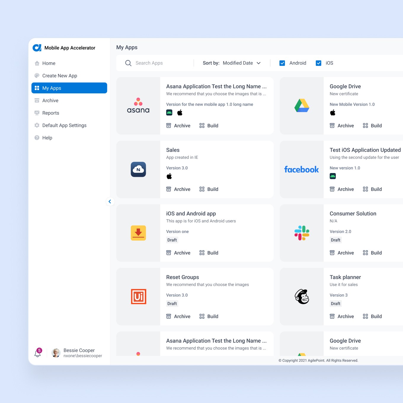
  • The navigation and interaction with the application list are not optimal, particularly for customers with a large number of apps, leading to a poor user experience.

Inventory/Audit

In order to address the pain points of our customers, we started the design process by creating medium-fidelity screen mock-ups, which were then presented to stakeholders for review; see the part of it below:
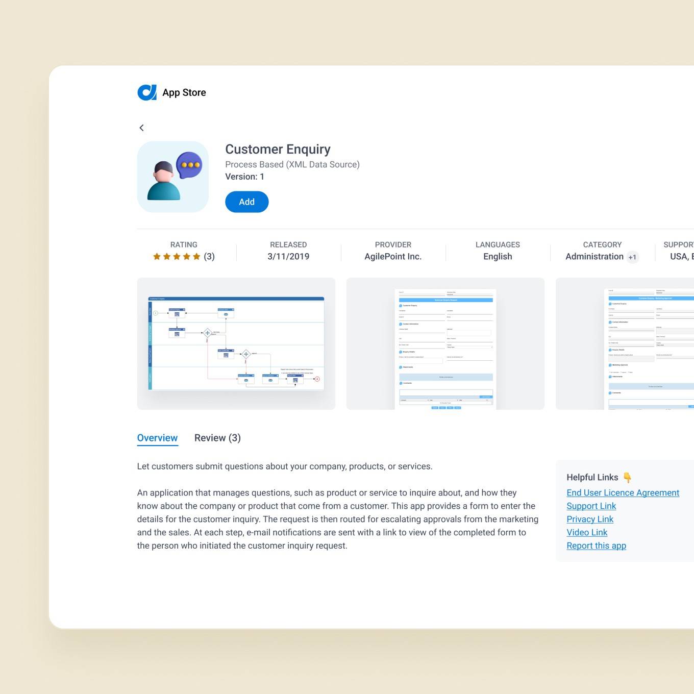
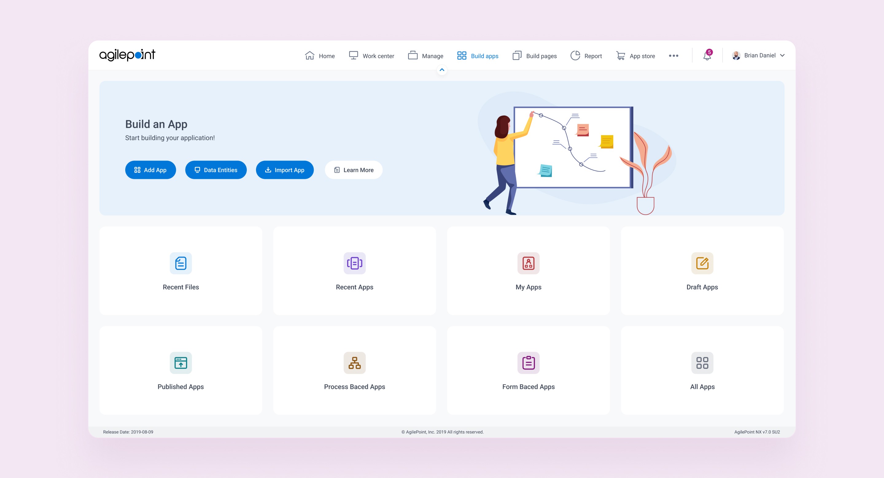
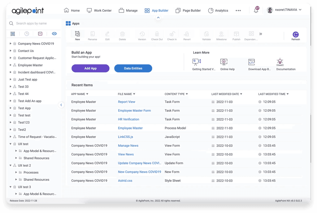
Solution

Based on feedback from stakeholders, I transformed the medium-fidelity prototype into high-fidelity screens. The images below show the changes made:

Final Clickable Prototype

After that, I built a clickable prototype to test the new design. This allows me to determine if the design is effective and user-friendly, as well as identify any potential issues that may arise during usage.

Outcomes

By conducting research and testing, we were able to effectively resolve all the issues we had and create a design that put the user first, was easy to use, and well-organized. The new home screens display information in a simple and straightforward way, and the enhanced hierarchy and navigation significantly enhance the user's overall experience.

Key Learning

Clarity Over Clutter

Too much information on one screen was overwhelming enterprise users, leading to confusion and lower engagement. We learned that simplifying the interface and clearly presenting information greatly improves user understanding and keeps engagement high.

Clarity Over Clutter

Too much information on one screen was overwhelming enterprise users, leading to confusion and lower engagement. We learned that simplifying the interface and clearly presenting information greatly improves user understanding and keeps engagement high.

Clarity Over Clutter

Too much information on one screen was overwhelming enterprise users, leading to confusion and lower engagement. We learned that simplifying the interface and clearly presenting information greatly improves user understanding and keeps engagement high.

Seamless at Scale

Enterprise users often manage many applications, so navigation must remain efficient and clear even as data grows. Designing with scalability in mind ensures the user experience stays consistent and positive when handling large app portfolios.

Seamless at Scale

Enterprise users often manage many applications, so navigation must remain efficient and clear even as data grows. Designing with scalability in mind ensures the user experience stays consistent and positive when handling large app portfolios.

Seamless at Scale

Enterprise users often manage many applications, so navigation must remain efficient and clear even as data grows. Designing with scalability in mind ensures the user experience stays consistent and positive when handling large app portfolios.

Complex Tools, Simple Flows

Even a powerful, feature-rich tool should feel intuitive to use. We maintained all existing functionality during the UI refresh so as not to disrupt users; instead, we reorganized and clarified the interface to prove that complex workflows can be streamlined without sacrificing capabilities.

Collaborative Iteration

Redesigning the App Builder was a team effort. We shared early prototypes with stakeholders for feedback and iterated quickly. Later, we listened to real users’ input to drive further improvements – reinforcing that collaboration and feedback at every stage lead to a better product.